Open Data is a hot topic. Almost everybody seems to agree that making local data available to the public makes perfect sense. No doubt, citizens benefit from the increasing transparency of processes in their city, but the publication of this data also brings up some questions that are uncomfortable for those private corporations that gather all our individual data and use it without our explicit permission. One of the core question is who should own the data that we produce as citizens and individuals: The institutions collecting the data that we generate through our use of their systems and services or we, the data producers, ourselves. Shouldn’t those banks, phone companies, credit card services, doctors, shops, network providers, internet retailers, search engines at least provide transparency of what they actually do with the data, thus giving us the chance to decide whether we want to use their services under those circumstances or not. Should they not provide us with access to the data produced by us, so we can monitor ourselves better and maybe improve our own recording systems and simplify our tax statements for example?
At the same time, we already suffer from such an overload of information, that perhaps only a minority of people would actually access ‘their’ data and make use of it. The same applies to the public data that is already accessible. Who but those who have an affinity to data are looking up public data sets that are made available and even make use of them? This is where data visualisation can help. Data visualisation is a medium which emphasises specific aspects of the given data and offers a particular reading of it. Thus it becomes an expressive an powerful communication tool, that can even create a new reality. Numerous groups like WE LOVE OPEN DATA and individuals worldwide have started to visualise open data for the public good, driven by their own curiosity and philanthropism.
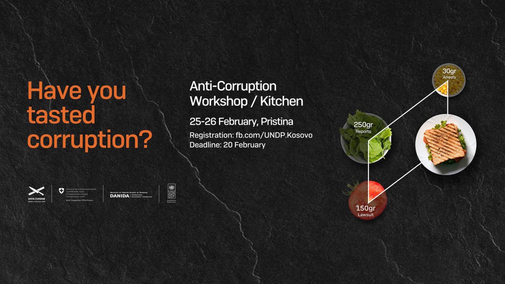
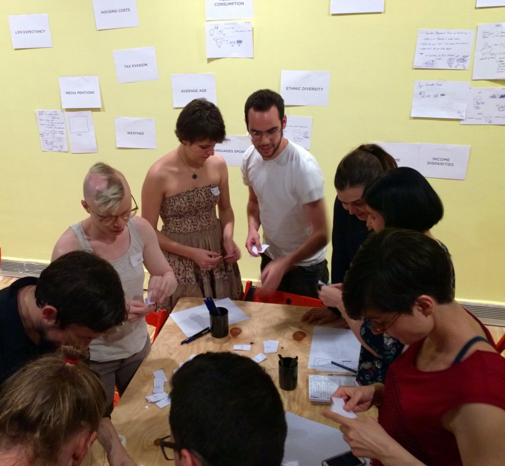
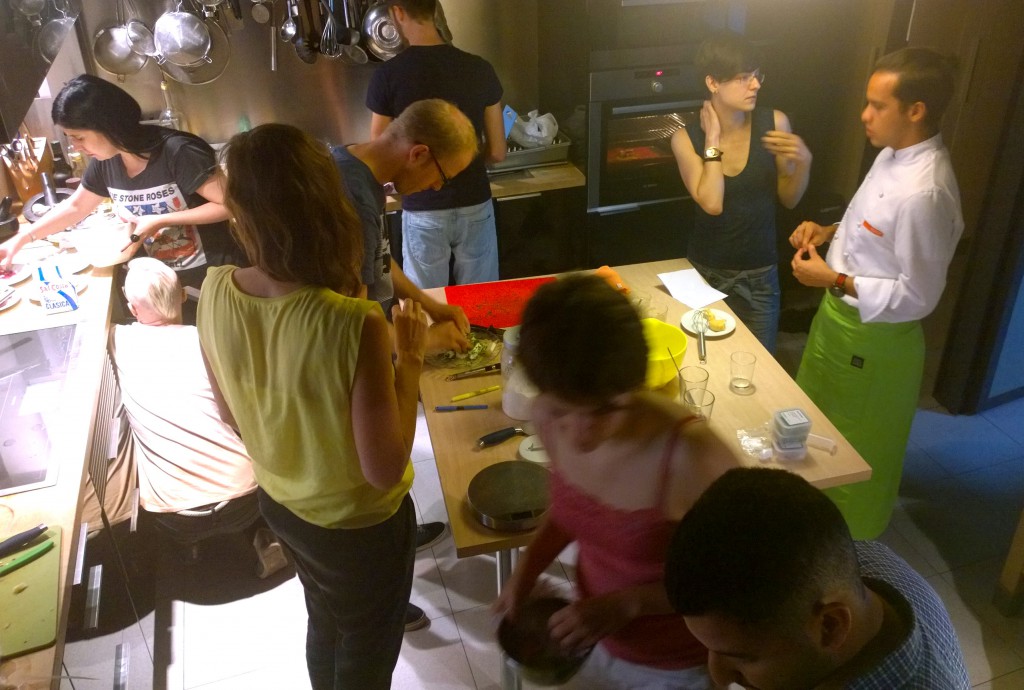
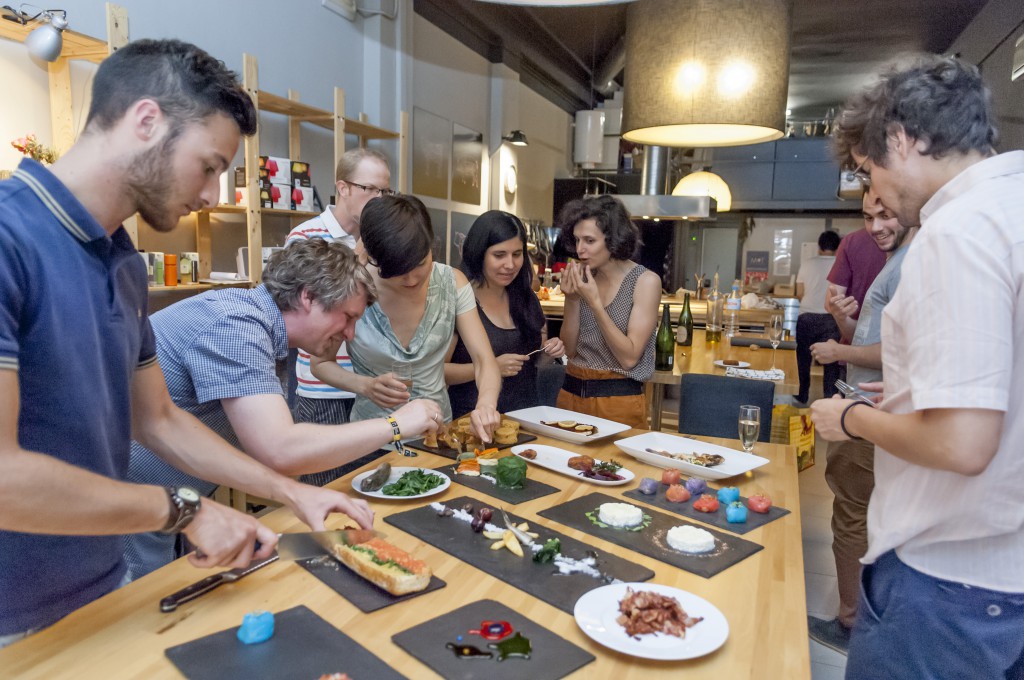
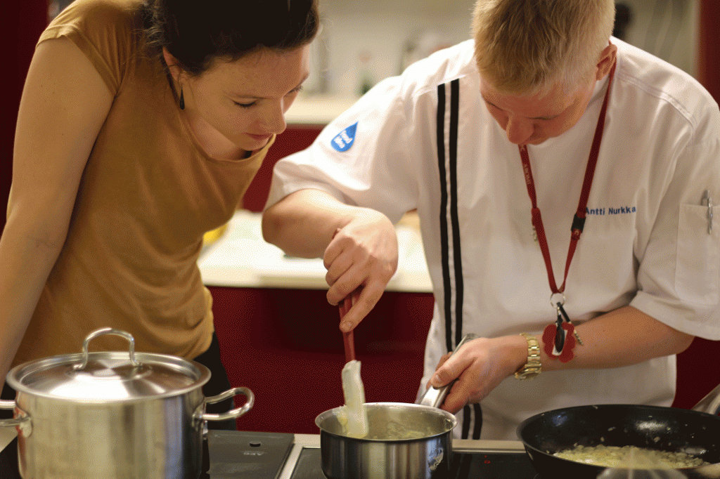
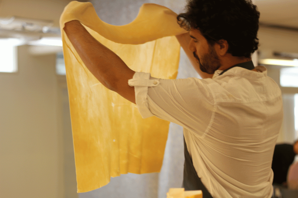
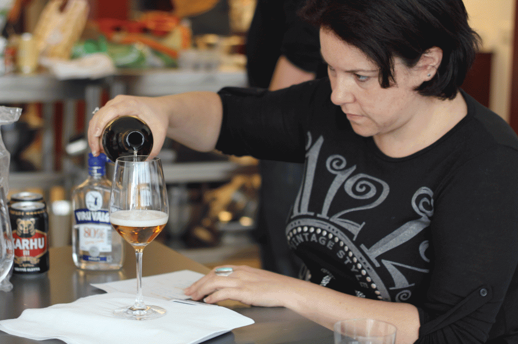
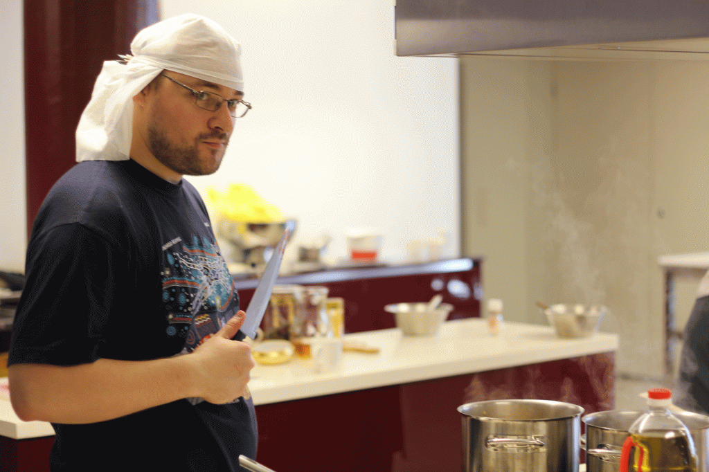
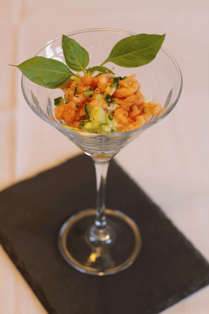
Translating rows of data into easy-to-read maps or comprehensive diagrams is one way of bridging the gap between dry numbers and the public. But why not going one step further and translating data into an even more sensual experience that we are all familiar with – like food? This is the basic idea of the Open Data Cooking Workshop. People who like to cook (and eat) are given an opportunity to explore both the local cuisine as well as local data by translating data into cooking recipes and meals. As much as this sounds fun, this collaborative research is supposed to give people concrete insights into the quality and diversity of the locally available data and teaches them principles of data representation. Through the very personal, emotional and sensual activity of cooking food they get involved with the material, be it vegetables or numbers.
After all, it looks like one of the challenges of the Open Data movement–next to opening up relevant data that citizens can relate to in a personal way–is to give people tools, methods and media enabling them to interpret, individualise and express data in an emotional way.

 Blog
Blog