Tag Archives: data visualisation

report workshop

What makes a good data chef?

The last edition of the Data Cuisine in 2015 brought us to Leeuwarden, where this year’s Media Art Friesland Festival centred on food as a topic. Leeuwarden is a small town in the north-west of the Netherlands. It’s a cosy and tidy place, where the real Frisians speak Frisian, a language that is the closest to English. It doesn’t have much manufacturing industry, and lives mainly from agriculture and service industry.

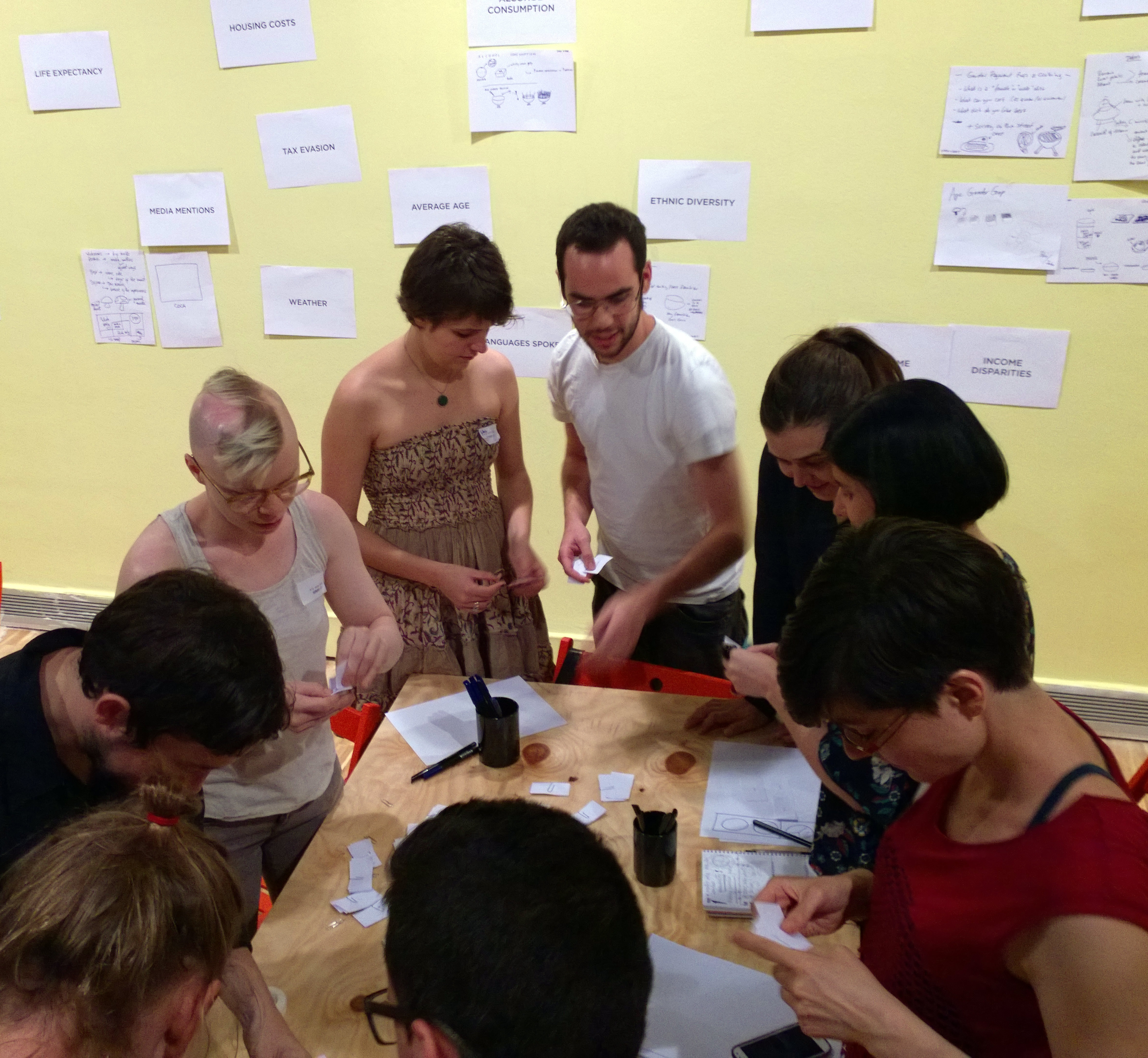
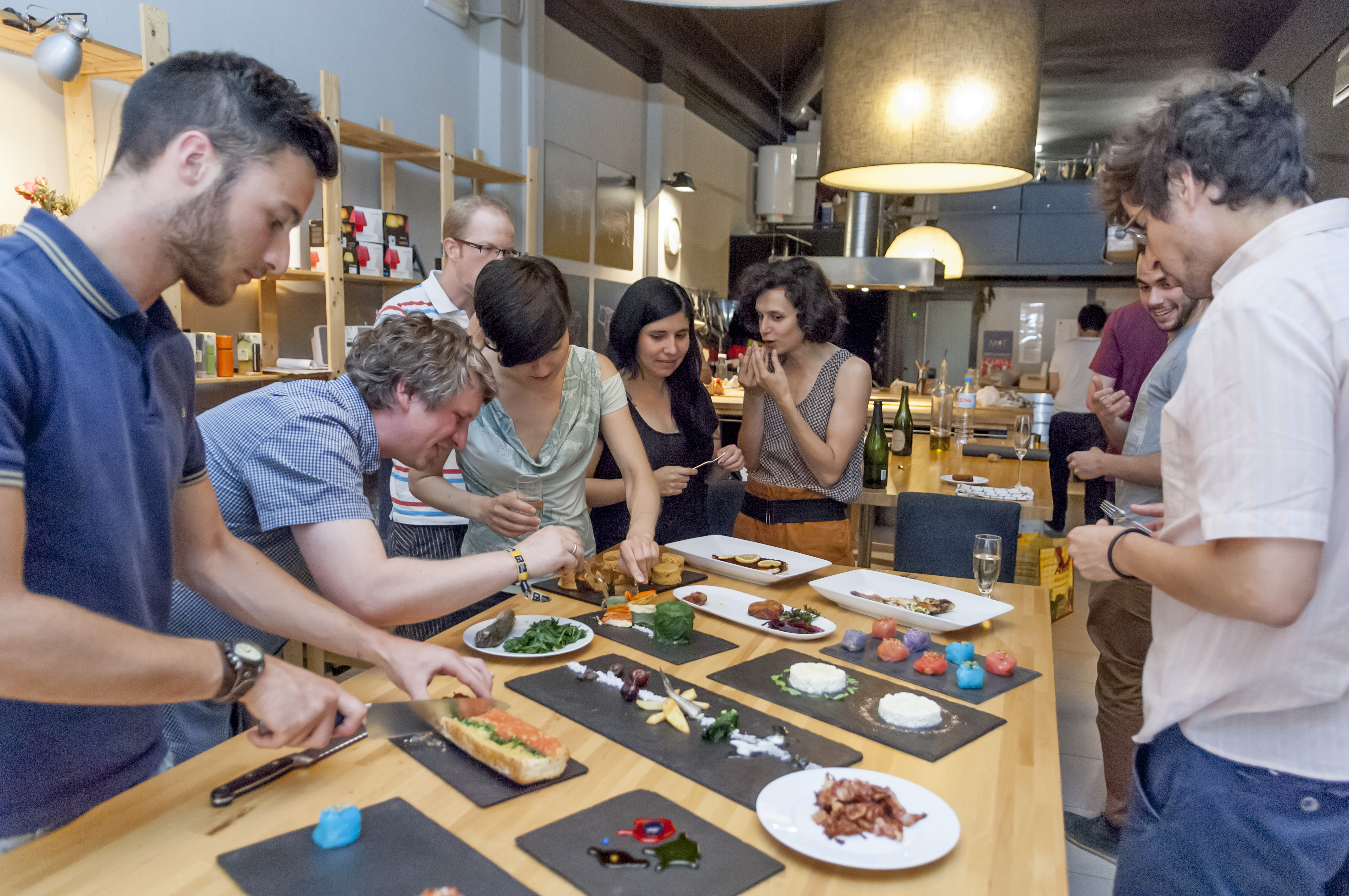
Eight people participated in the workshop and of these three were from Leeuwarden. Like often, when we run a Data Cuisine workshop, people from other cities or even countries travel to join the workshop. This time, most participants lived in the Netherlands, but some originally came from Sweden, Germany or Austria.

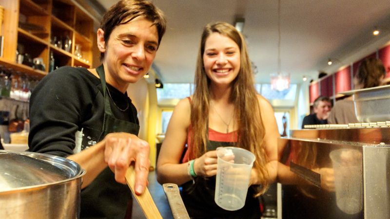
Working with such a small group sounds like spending a lot of resources on a workshop whose experimental character doesn’t promise any kind of immediate revenues. But Data Cuisine workshops are intense, in that for most participants it’s not easy to bring the data and the food together — which means a lot of knowledge transfer, support and talking on the our part. In Leeuwarden, where we didn’t have two full days for the workshop, we felt that more participants could have been problematic in this regard.

Having run this workshop six times already, we have learnt that participants mainly struggle with two challenges, both connected to the data:

Knowing which story to tell and finding the data, that support the story

A data dish is only as good as the story you want to tell or the statement you want to make with it. Some participants arrive at the workshop, knowing exactly what they want to say with a dish, but they don’t have the right numbers at hand that they could use. Finding the necessary data set during the workshop is almost impossible — if the particular statistical data exist at all. Unfortunately, a good amount of ideas for data dishes couldn’t be realised simply because the data was missing.

In other cases, people bring data to the workshop, that they find interesting, but the numbers don’t allow an interesting comparison. But a high-contrast comparison between data points is necessary for representing statistical data with food, since food is not a super-precise but rather a ‘low-res’ medium.

It does not sound too difficult to find a story to tell or a statement to make —­ but sometimes it’s exactly this part that challenges participants most. It’s easy to get hooked by some interestingly looking data, but that’s not enough to create a good data dish. The stronger your own angle is on the data, the better the dish.

DCMAF1DCMAF2DCMAF3dc-leeuwarden-high-skale

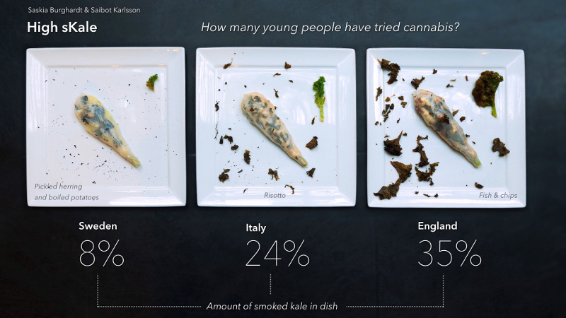
A statistics on cannabis consumption among 15-16 year old kids inspired Saskia and Saibot. They have never tried cannabis and wanted to make a statement about kids not having to. They wanted to create a dish that could serve as an alternative to smoking a joint — a dish that gives you a natural high because of its taste.

The second big challenge is to transfer the data into food

It seems to be rather difficult for most participants to stick to the data and to work on a more or less precise representation. Certainly, it’s easier to use the statistics for inspiration only. We however insist on the relative accurateness of the transferred data, because the precision of the data gives a dish a true kick. In order to be precise, we can’t avoid rulers and balances, measuring cups and sometimes calculators.

To sum up, being a Data Cuisine chef requires rich imagination, an associative mind, but also the ability to enjoy precision and the challenges that come with it. Data visualisation and representation is a language with a distinct set of rules and a huge vocabulary. It becomes exciting when you follow those rules and when you are able to choose the right “words” out of the vast array of possibilities in order to say what you think.

DCMAF02DCMAF01dc-leeuwarden-fresh-pasta-old-people_kl

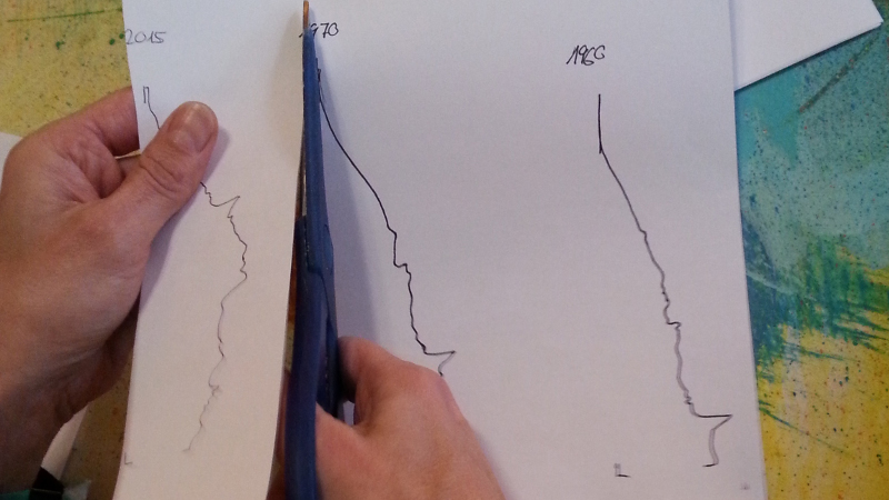
Daan, Anja and Franzi expressed their concern about the ageing Dutch society. They chose data in the form of the population pyramid of Dutch citizens in 1960, 2015 and 2050, and created a pasta graphics with it. The three colours represent the young (green), the not-so-young-anymore (red) and the old (black). In order to give a taste of the different age groups, the 1960’s pasta is topped with a meat sauce made with a prefab blend of spices by Knorr. The 2015 ‘back-to-basics’ pasta comes with Carbonara, and the pasta of the future is a mix of noodles and Wakame salad.

More on the results of the Leeuwarden Data Cuisine workshop can be found here: http://www.citylab.com/design/2015/11/more-delicious-dishes-from-the-masterchefs-of-data-cuisine/416511/

open data workshop

Data Cuisine workshop and buffet in Berlin

data cuisine - MiCT - food slides - 1024.007_LR

For the fist time Data Cuisine was invited by a an organisation — MiCT — instead of an art institution, with the goal to develop a unique flying data buffet for a special event: the organisation’s 11th anniversary and the Open Eye Award ceremony. Media experts from MiCT, the chefs Sebastian Becker und Maximilian Haxel from bestecklos FingerFood Berlin, Moritz Stefaner and Susanne Jaschko (prozessagenten) collaborated on creating a flying Data Cuisine buffet that translates media related data of some of the countries where MiCT works into a culinary experience. It was a truly challenging assignment.


We started with a brainstorming in order to identify some of the areas that MiCT wanted to focus on. The second part of the workshop was about whirling around ideas, casting them away, picking them up again and getting our hands dirty and — after all of this — ending up with something that is not only edible but also tells a data story.
Each of the dishes represents another surprising set of data — each tells a story or poses interesting questions about the media use and the media landscape in North Africa, the Near East or Cuba. On the night of the event 200 guests experienced the seven data dishes and and were surprised not only by the facts and stories but also the unusual method of data representation.


The image above shows a visualisation of the percentage of internet users that use Facebook. The amount of Facebook users is visualised by the amount of blue sprinkles.
In Tunisia, the number of Facebook users is very high, whereas in Egypt it’s much lower. These numbers makes us wonder whether there is indeed a connection between the use of Facebook and the results of the Arab Spring. In Tunisia, the Arab Spring had a sustainable impact on the democratisation of society, very much in contrast to the situation in Egypt, that fell back under totalitarian leadership.


Two further examples:
data cuisine - MiCT - food slides - 1024.002_LR

An omelet spiced with cumin and pepper, that’s popular in Syria. It comes with three different cremes: one based on mayonnaise, one being a yoghurt-creme with mint, and a mango-curry-creme based on white cheese. With these three cremes, the workshop participants Majid, Christine and Marketa tried to bring to our attention the somewhat surprising fact that support for Islamic State among Arabic-speaking social media users in Belgium are greater than in the militant group’s heartlands of Syria for example. In Syria, ISIS appears to be dramatically losing the battle for support with more than 92% of tweets, blogs and forum comments hostile to the militants. But the jihadist militants are successful at spreading their message and their efforts appear to be having an effect: outside Syria, support for Isis rises significantly. One can taste the grade of the ISIS support in the cremes. According to the numbers, red pepper was added to them.

data cuisine - MiCT - food slides - 1024.006_LRThis dish combines two variations of potato and compares the numbers of employees in state media in Tunisia, Iraq, Egypt and Iran. In Egypt there are 57.000 people employed in state media, which is quite a big number — whereas in Tunisia it’s only a thousand. This dominance of state media of course influences the public sphere and seems to go hand in hand with the authoritarian rule in Iran and Egypt. Interestingly enough, in Iraq the number of employees is comparably low, and that speaks for a more liberal society than we might think or than we are told. To be discussed.
In order to express this feeling of dominance of state media, Anja and Maral came up with the idea to represent it by a piece of potato, that per se is dense and a bit one-dimensional when it comes to taste. In contrast, the potato espuma — representing a higher grade of liberality and variety of media — feels light on the tongue and is definitely more colourful.

Find all images and dishes on Data Cuisine.

Image credits: Photographs by Uli Holz, graphics by Moritz Stefaner


open data workshop

What’s the taste of data? The Data Cuisine workshop in Barcelona

How does a tortilla taste whose recipe is based on well-being data in Spain? Would you rather like the cake based on the science funding 2005 or in 2013? Can you imagine how a fish dish can represent the emigrants from Spain to countries across the world?


The second Data Cuisine workshop took place in Barcelona on June 10-13, 2014 as part of the Big Bang Data exhibition at CCCB, and in coordination with Sonar.
For the culinary side of the project, we collaborated with Sebastian Velilla, a fantastic chef who has worked for the Alicia Foundation and is currently involved in the activities of the Torribera Food and Nutrition Campus of the University of Barcelona.datacuisine_BCN1
On four afternoons, twelve participants explored data of Barcelona, Catalonia and Spain with culinary means.
The first two afternoons were about getting into the methodology and coming up with quick ideas how to represent topics and data with dishes. We got some inspiration from our exclusive visit to Ferran Adria’s BullipediaLab, an emerging space dedicated to the research of food creativity.
datacuisine_BCN2We spent the second half of the workshop in the kitchen, where the participants refined their recipes and made first tests and prototypes. On the last day, the participants, of which many worked in groups of two or three, produced their final dishes. The workshop ended with a presentation and tasting of all data dishes.
datacuisine_BCN3
Thanks go to Jose Luis de Vicente and Olga Subiros for bringing us over, and our fantastic participants, especially Luis Fraguada, who brought a food printer, which we will surely hear more of in the future.
All results of the Barcelona workshop and more images can be found on the Data Cuisine website. You can also follow us on Facebook or Twitter
. The Data Cuisine workshops are led by prozessagent Susanne Jaschko and Moritz Stefaner.


open data workshop

New edition of Data Cuisine Workshop in Barcelona

Print

We are very excited to announce a new edition of the Data Cuisine Workshop! It will take place in Barcelona, June 10-13, 2014, as part of the program around the Big Bang Data exhibition at CCCB, and in coordination with Sonar. For the culinary side of the project, we will collaborate with Sebastian Velilla, a master chef who has worked for the Fundacio Alicia and the Academic Unit UB-Bullipedia-CETT.

open data process + design workshop

2nd day: It’s all about food

On the second day of the Open Data Cooking Workshop in Helsinki we moved to Aromi Kitchen, a kitchen for cooking classes, and started to get our hands dirty. The workshop participants had selected their topics and data the day before. They also had done most of the shopping and thought out their recipes.

So Sunday was all about working with the ingredients and learning from Antti how to create delicious and good looking dishes while Miska, the data hunter, helped to find the last bits and pieces of missing data and Moritz and I were busy documenting what was going on.

Symeon makes his dough for the Lasagne called Spiced Foreigners Between Pasta that compares Finland’s population with and without immigrants.

Rossana mixes her Suicide Cocktail based on Finnish, German and Italian data on suicide rates, monthly average wage, alcohol consumption and average temperature.

Dimitrii gets ready to cut beet roots for his Criminal Herring in Fur Coat based on Finnish Crime Rates in 2011.

Hero shot of Jen’s Happiness Cocktail visualising the amount of smiling Facebook friends…

…and of Nathalie’s and Melinda’s Lakmoussetikka showing the amount of harvested blueberries (jelly on top) in relation to the amount of blueberries that are not picked in Finland (white chocolate mouse).