The last edition of the Data Cuisine in 2015 brought us to Leeuwarden, where this year’s Media Art Friesland Festival centred on food as a topic. Leeuwarden is a small town in the north-west of the Netherlands. It’s a cosy and tidy place, where the real Frisians speak Frisian, a language that is the closest to English. It doesn’t have much manufacturing industry, and lives mainly from agriculture and service industry.
Eight people participated in the workshop and of these three were from Leeuwarden. Like often, when we run a Data Cuisine workshop, people from other cities or even countries travel to join the workshop. This time, most participants lived in the Netherlands, but some originally came from Sweden, Germany or Austria.
Working with such a small group sounds like spending a lot of resources on a workshop whose experimental character doesn’t promise any kind of immediate revenues. But Data Cuisine workshops are intense, in that for most participants it’s not easy to bring the data and the food together — which means a lot of knowledge transfer, support and talking on the our part. In Leeuwarden, where we didn’t have two full days for the workshop, we felt that more participants could have been problematic in this regard.
Having run this workshop six times already, we have learnt that participants mainly struggle with two challenges, both connected to the data:
Knowing which story to tell and finding the data, that support the story
A data dish is only as good as the story you want to tell or the statement you want to make with it. Some participants arrive at the workshop, knowing exactly what they want to say with a dish, but they don’t have the right numbers at hand that they could use. Finding the necessary data set during the workshop is almost impossible — if the particular statistical data exist at all. Unfortunately, a good amount of ideas for data dishes couldn’t be realised simply because the data was missing.
In other cases, people bring data to the workshop, that they find interesting, but the numbers don’t allow an interesting comparison. But a high-contrast comparison between data points is necessary for representing statistical data with food, since food is not a super-precise but rather a ‘low-res’ medium.
It does not sound too difficult to find a story to tell or a statement to make — but sometimes it’s exactly this part that challenges participants most. It’s easy to get hooked by some interestingly looking data, but that’s not enough to create a good data dish. The stronger your own angle is on the data, the better the dish.
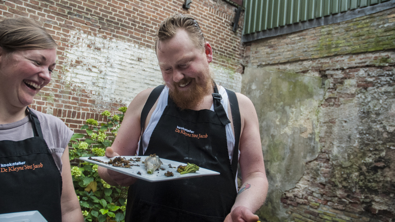
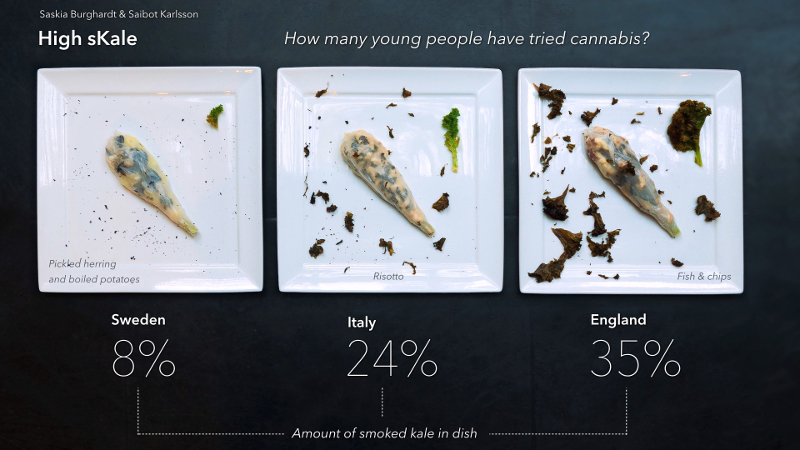
A statistics on cannabis consumption among 15-16 year old kids inspired Saskia and Saibot. They have never tried cannabis and wanted to make a statement about kids not having to. They wanted to create a dish that could serve as an alternative to smoking a joint — a dish that gives you a natural high because of its taste.
The second big challenge is to transfer the data into food
It seems to be rather difficult for most participants to stick to the data and to work on a more or less precise representation. Certainly, it’s easier to use the statistics for inspiration only. We however insist on the relative accurateness of the transferred data, because the precision of the data gives a dish a true kick. In order to be precise, we can’t avoid rulers and balances, measuring cups and sometimes calculators.
To sum up, being a Data Cuisine chef requires rich imagination, an associative mind, but also the ability to enjoy precision and the challenges that come with it. Data visualisation and representation is a language with a distinct set of rules and a huge vocabulary. It becomes exciting when you follow those rules and when you are able to choose the right “words” out of the vast array of possibilities in order to say what you think.
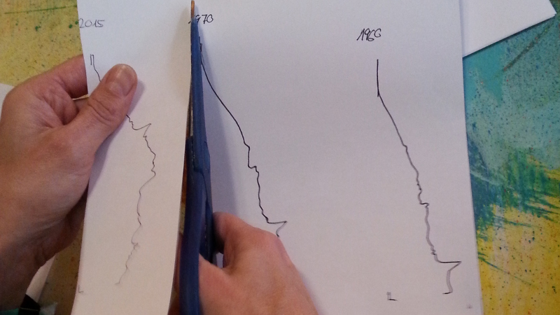
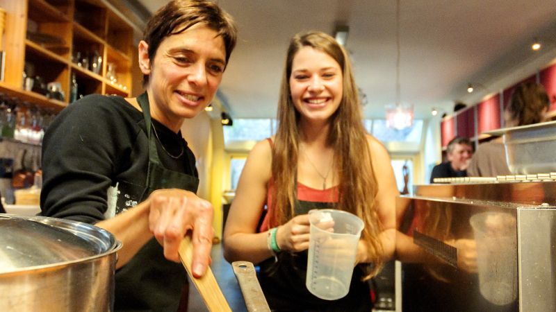
Daan, Anja and Franzi expressed their concern about the ageing Dutch society. They chose data in the form of the population pyramid of Dutch citizens in 1960, 2015 and 2050, and created a pasta graphics with it. The three colours represent the young (green), the not-so-young-anymore (red) and the old (black). In order to give a taste of the different age groups, the 1960’s pasta is topped with a meat sauce made with a prefab blend of spices by Knorr. The 2015 ‘back-to-basics’ pasta comes with Carbonara, and the pasta of the future is a mix of noodles and Wakame salad.
More on the results of the Leeuwarden Data Cuisine workshop can be found here: http://www.citylab.com/design/2015/11/more-delicious-dishes-from-the-masterchefs-of-data-cuisine/416511/




 Blog
Blog